Pagination
Discovery
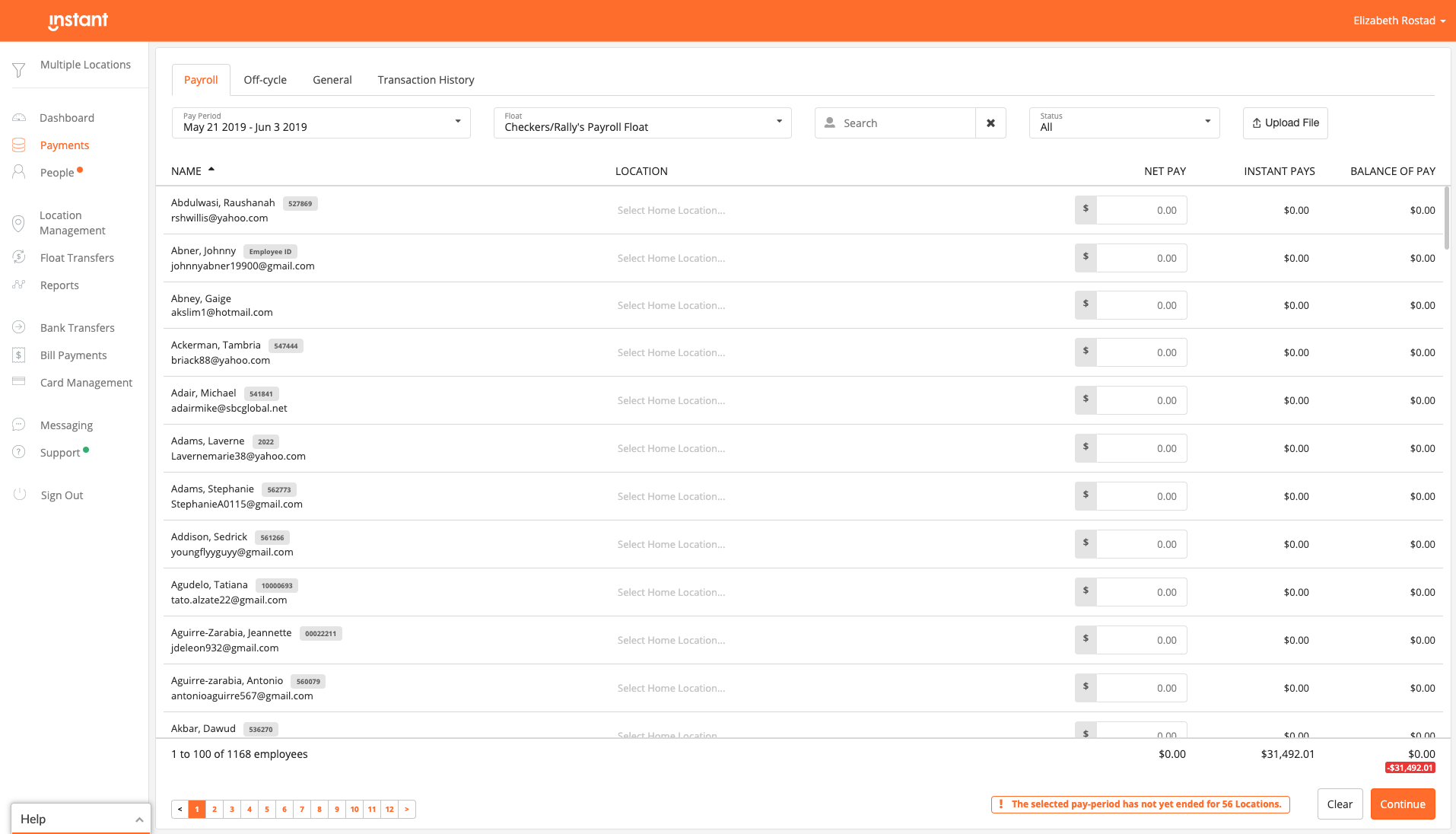
New large enterprise customers adopting our product found that due to the size of their employee base, they commonly experienced performance issues when loading large volumes of data. To solve this pagination was added as a solution.
This came with its own issue. When more than 7 pages were being displayed it crowded the space below the report and covered other components creating user experience and screen responsiveness issues.

Research and validate
During customer interviews we found that users handling more than 7 pages of results looked at the middle pages less. Users often looked at the first and last set of pages for reconciliation purposes.
After some industry research and competitive analysis to see what the best practices were for long pagination, I found that it was common to collapse the middle pages if it reached a certain number. Based on the customer interviews, we knew the middle pages did not need to be displayed. Instead, users needed a quick way to navigate to the first and last set of pages and if needed, easy navigation between the middle pages.
Sketching the interaction
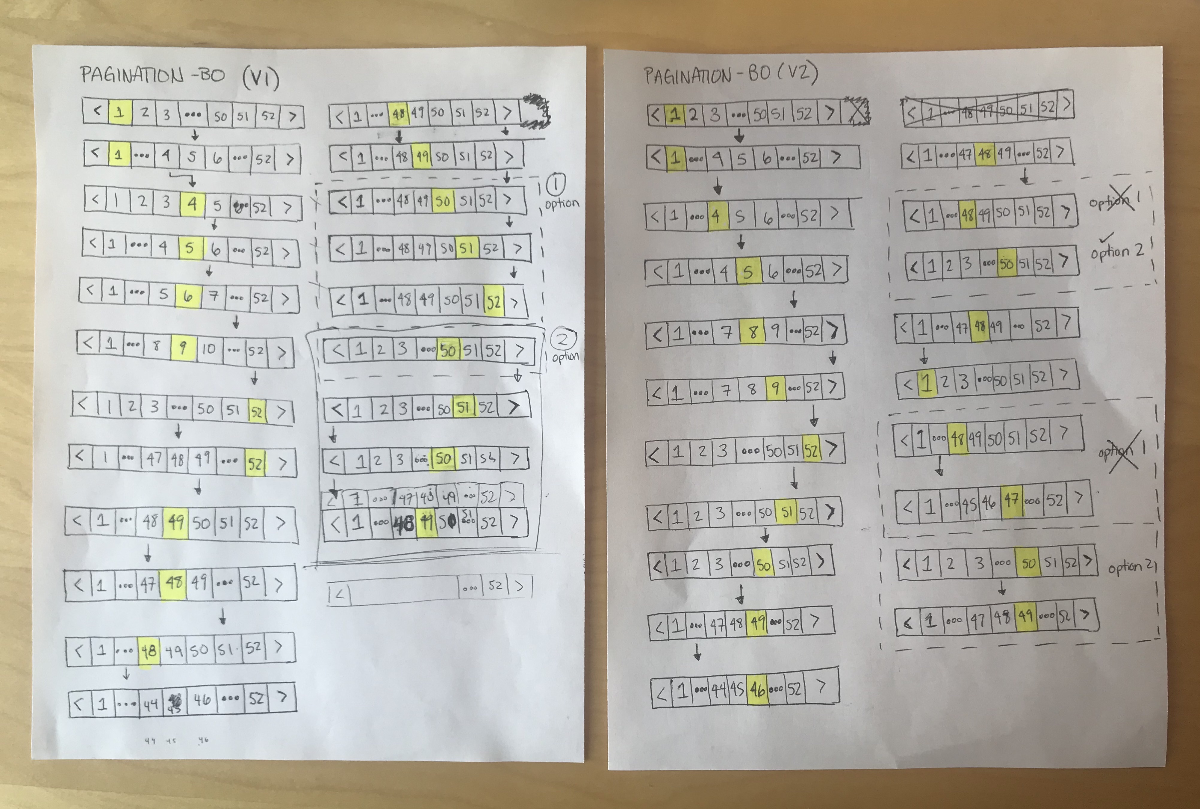
Sketching the new pagination was easy. We knew it needed to include a collapsed menu in the middle and the first and last page always needed to be displayed for the users reference.
Finding an interaction pattern that’s consistent and intuitive to use when navigating between the middle pages was challenging.
After exploring 4 different patterns of behaviour, we picked the top 2 versions.

| Version 1 | Version 2 | |
| Approach | When you clicked the ellipses, the middle would expand and it would auto select the middle number. When moving pages, the numbers would change the active button would stay in the same spot. Once you reach the start or end of the pages, the active button would then move. | When you clicked the ellipses, the middle would expand and it would auto select the first number.
When selecting the ellipses from the middle, it would skip three pages. When selecting the arrows, it would move the active button would move one by one until you reached the ends. |
| Pros |
|
|
| Cons |
|
|
After comparing both versions, we did some hallway tests with colleagues covering the patterns and asked one by one what they expected the behaviour to be when they clicked a certain number. We found that in version 1, the active button staying in the middle while the numbers shifted over was unexpected. The participants wanted it to highlight the page they just clicked, not shift to the middle as well.
When we tested Version 2, participants were able to accurately predict what the behaviour would be. They reported that the consistent behaviour helped them predict what would happen and made it easier to navigate between the middle pages.
High fidelity mockups
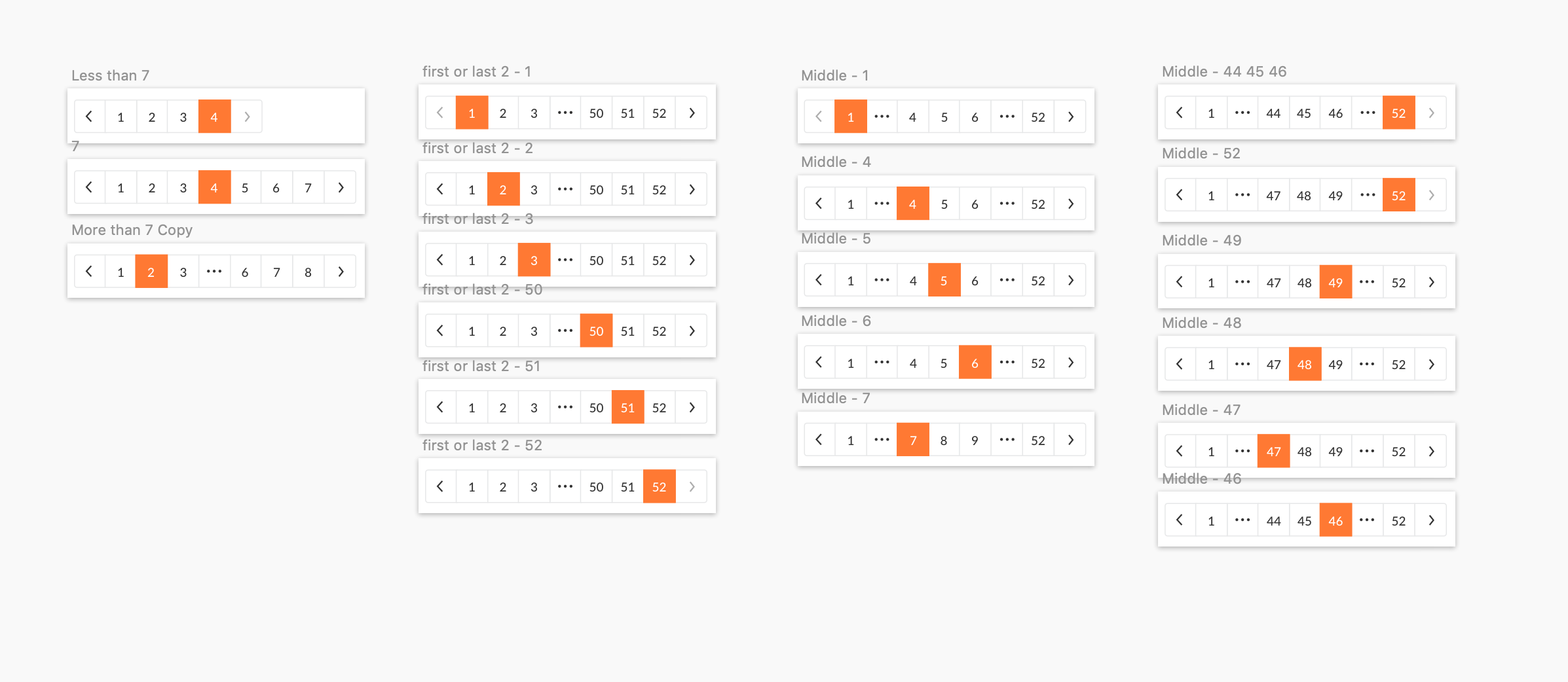
We used the existing framework for the new pagination we built in Version 2 but made some colour changes.
Each page number and the active arrows were in the primary call to action colour. We changed these to off-black so the active page you’re on stands out more.
The active arrows were an off-black which is frequently used as an active button colour in the back office. We changed the inactive buttons to a faded grey.
The styling was then applied to the 4 different variations of the pagination component.


Pagination rules defined
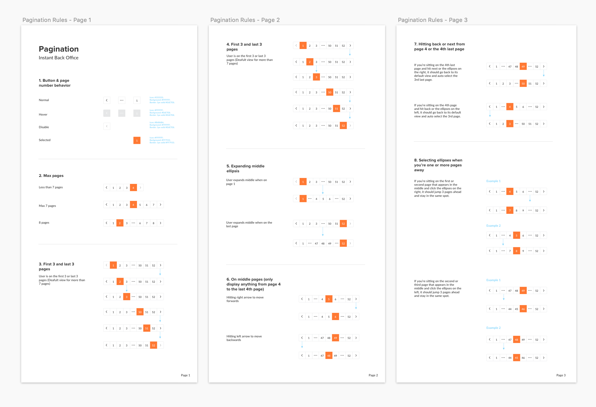
To help communicate the pagination behaviour internally to the team, I built a rule book that illustrated the expected behaviour for all possible edge cases.

Future
Giving users a simplified pagination that allows them to easily navigate through all the pages without displaying them all at once is just the beginning. We hope to give users more control over their experience so they can perform their tasks faster and easier. One way is by adding the option of jumping to a certain page rather than having to scan through multiple pages.
Category:
Instant Financial
