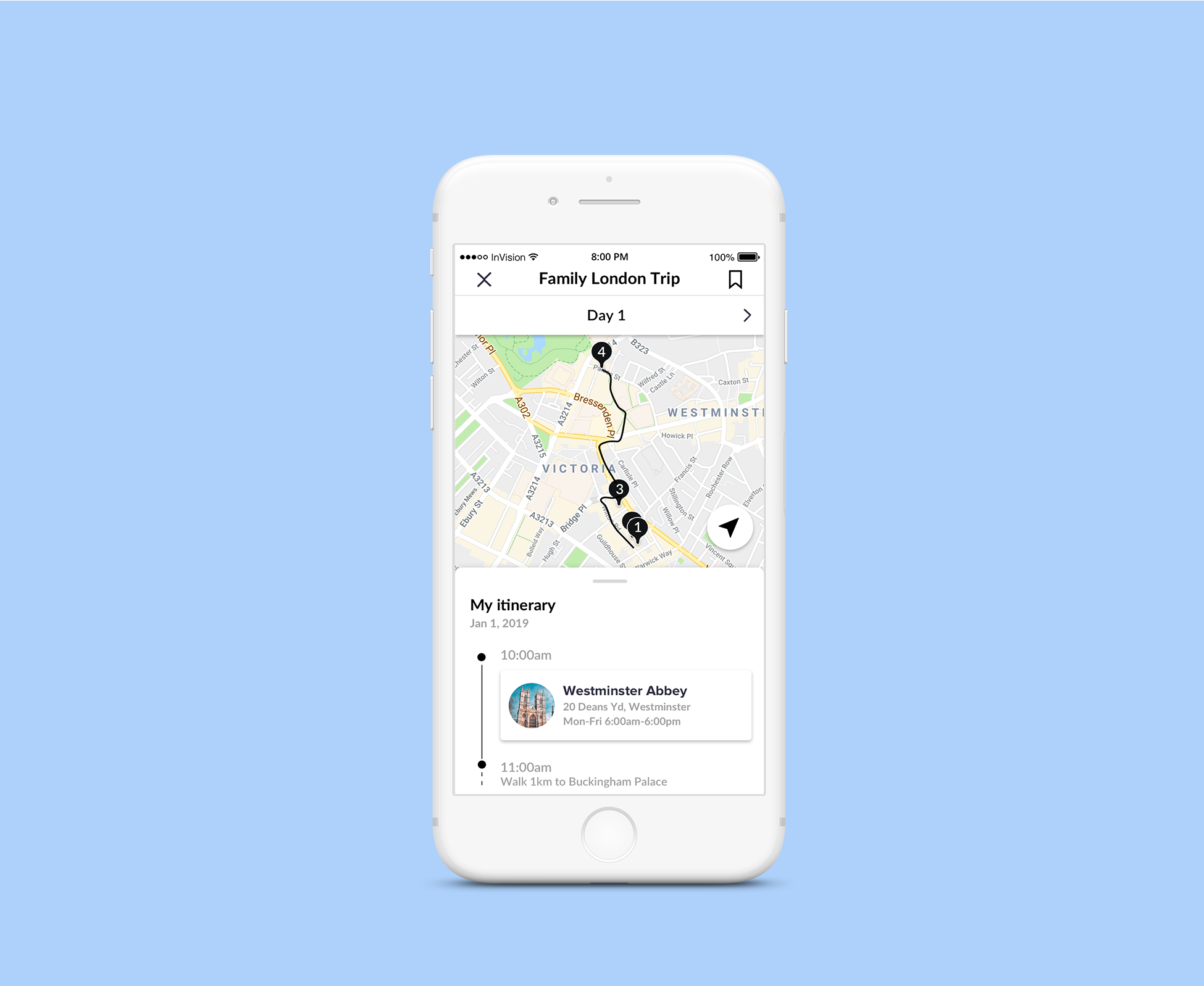
Trip planning – interview task
Design Task
After our initial release of Wishlists, the stats have shown us that the usage of Wishlists isn’t as high as we would like. And some users who do use them, often don’t return to continue using a Wishlist they created.
Looking at the current user experience of Wishlists in the site or app, we would like you to: identify challenges and opportunities to the current user experience and design – suggest potential improvements to any part of the flow or design.
The Problem
For the business:
Adoption of the wishlist feature is low and users that use the feature often don’t return to continue using the wishlist they created.
For the user:
I had to do some more digging…
Collecting feedback
With the limited resources I had, I decided to collect public reviews posted on their Apple and Google App reviews. I was able to collect enough positive and negative feedback on the app.
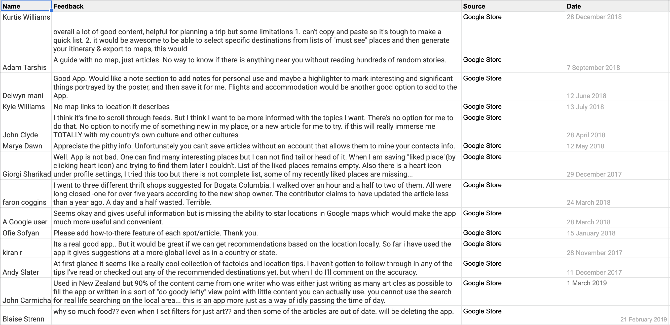
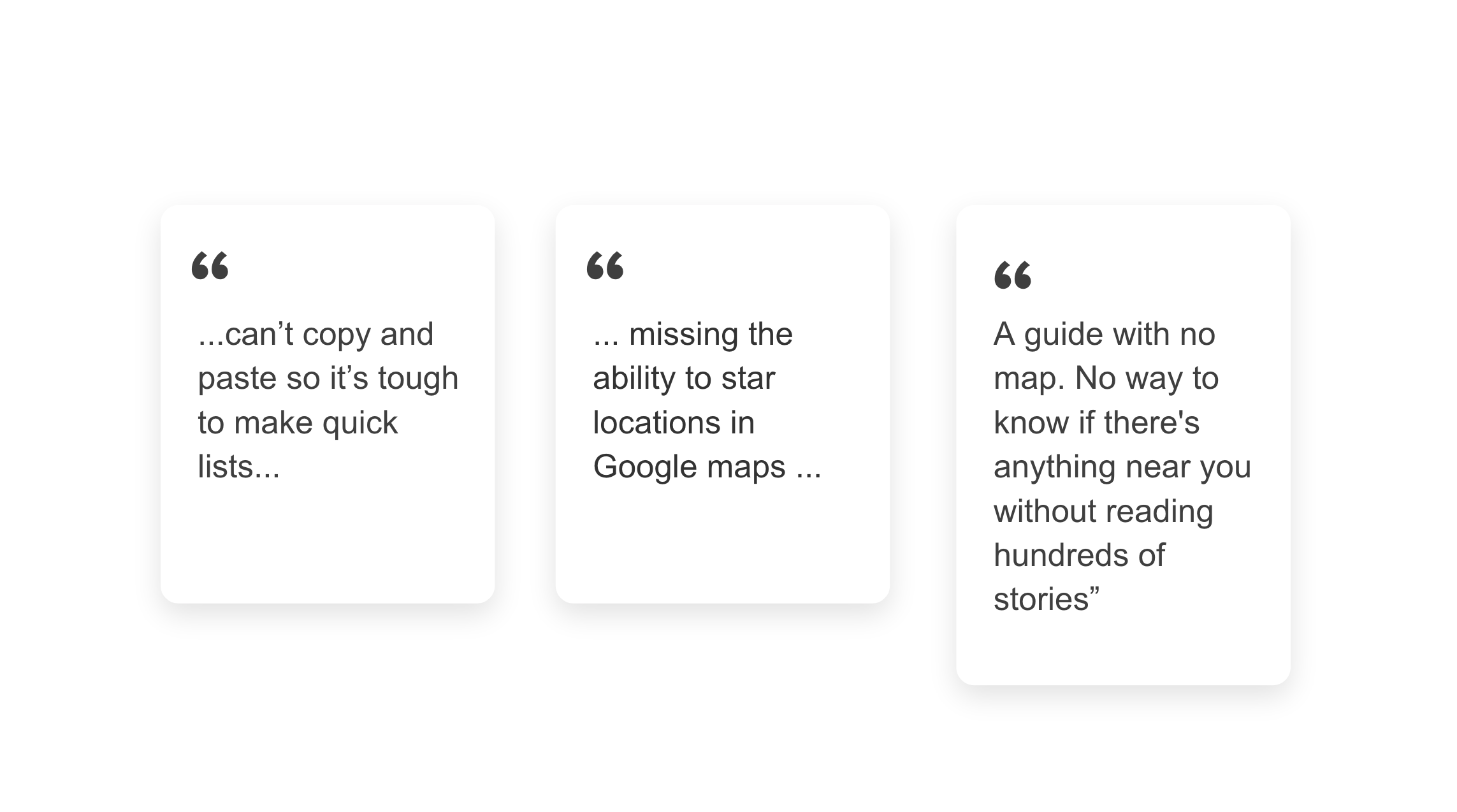
Here are just some of the comments I found:
Based on the user feedback I was able to collect, I was able to determine what needs were and weren’t being met by the users.
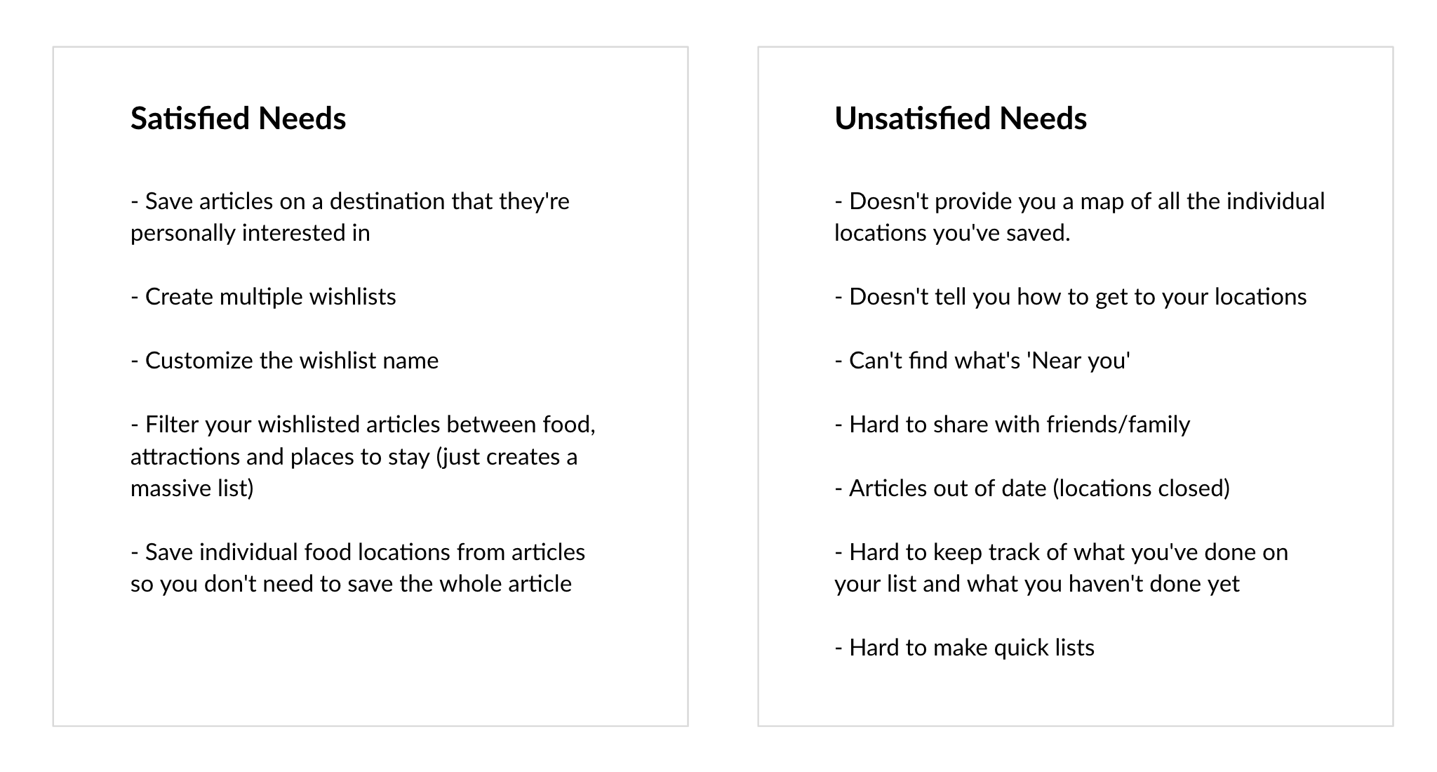
Now that I had a clear picture what needs weren’t being satisfied for the user, I was able to define the problem for them.
For the user:
Users find it difficult to navigate the content and action it while they’re travelling.
The Goal
The goal is to design a solution for Wishlists that helps travellers successfully and efficiently use their wishlists to improve their overall travel experience.
But what does their travel experience look like?
Understanding the Users
I quickly interviewed 3 people I knew who travel frequently and have used apps to plan their travel.
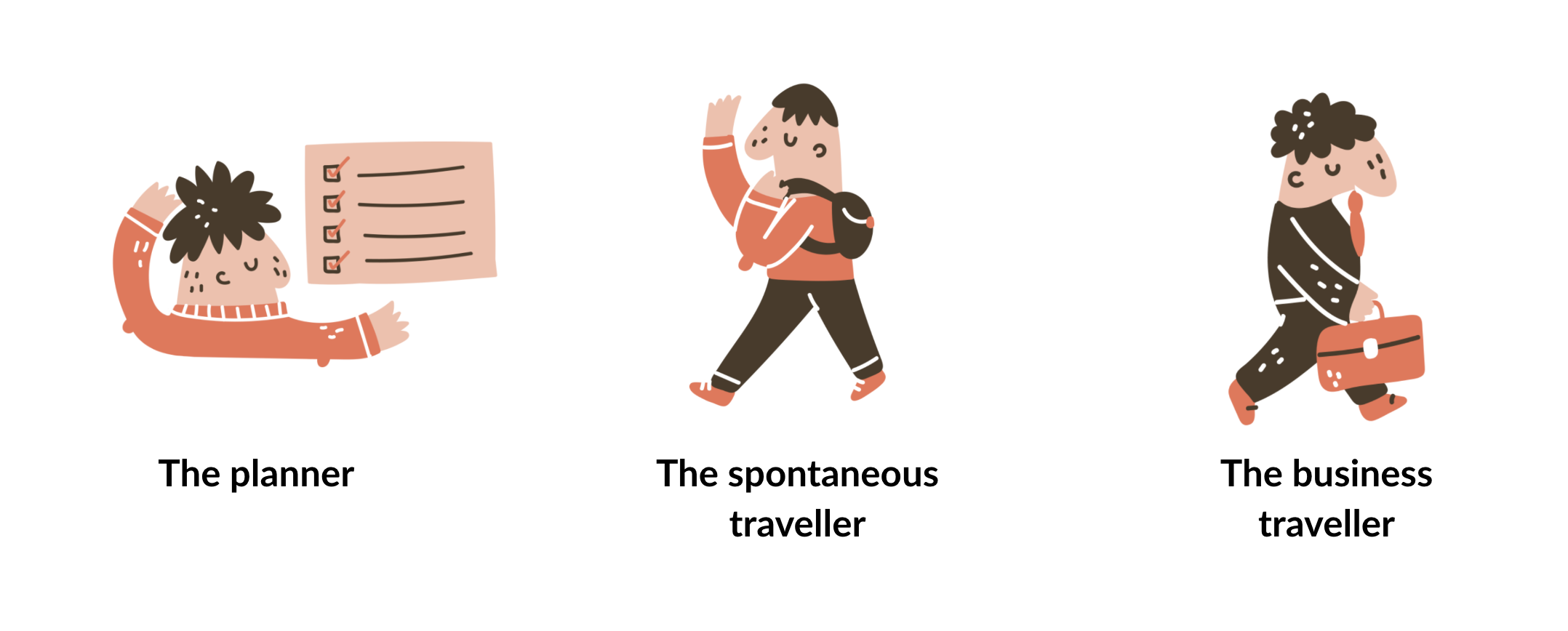
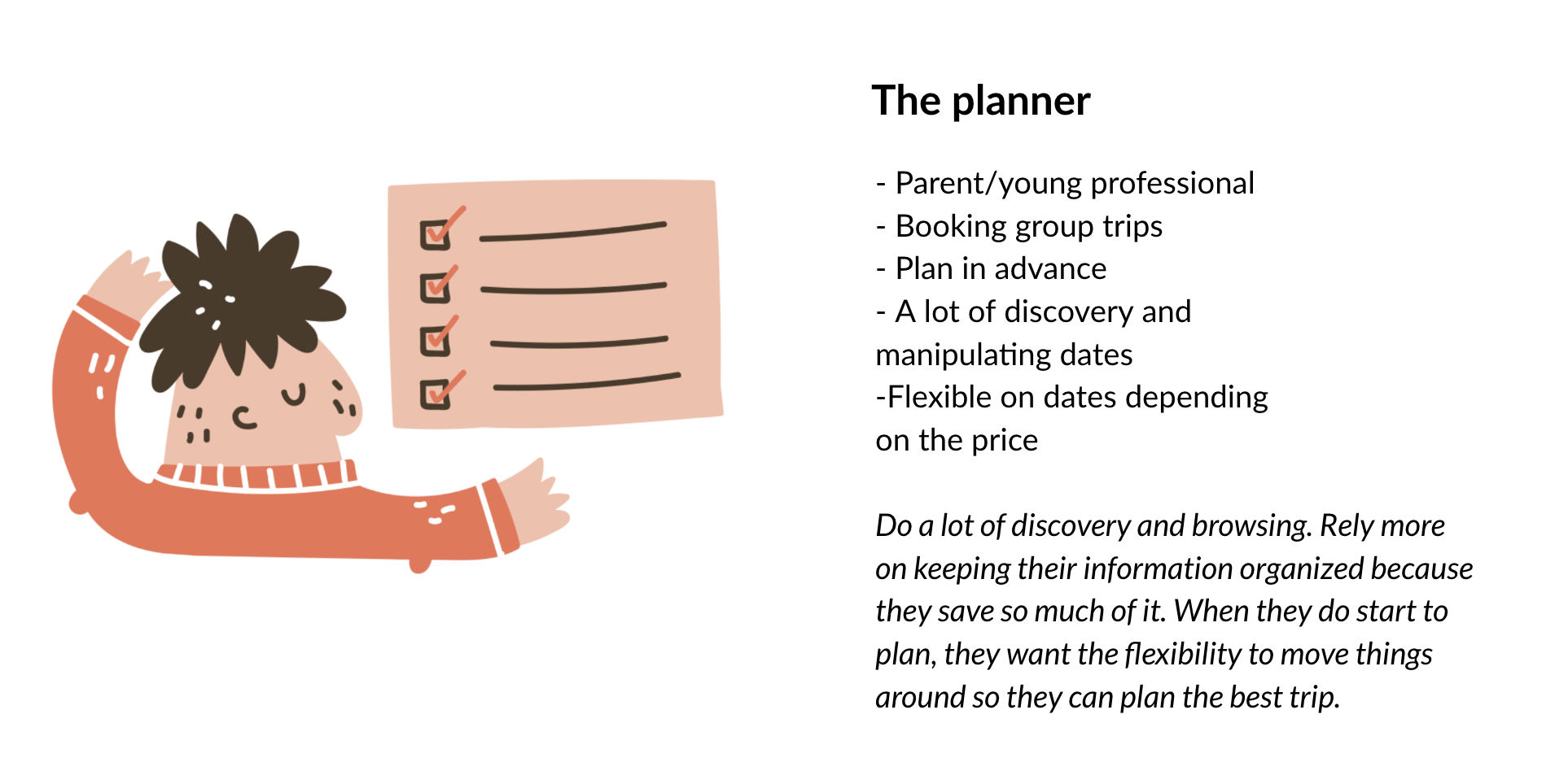
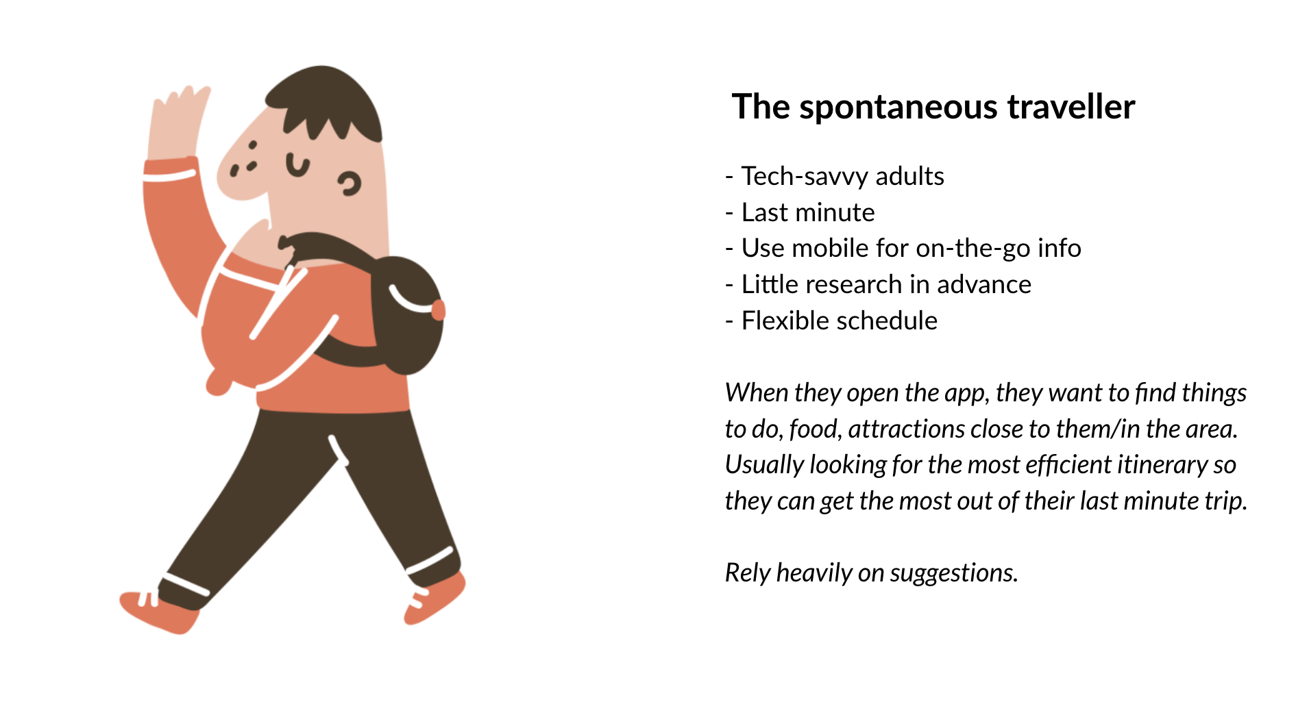
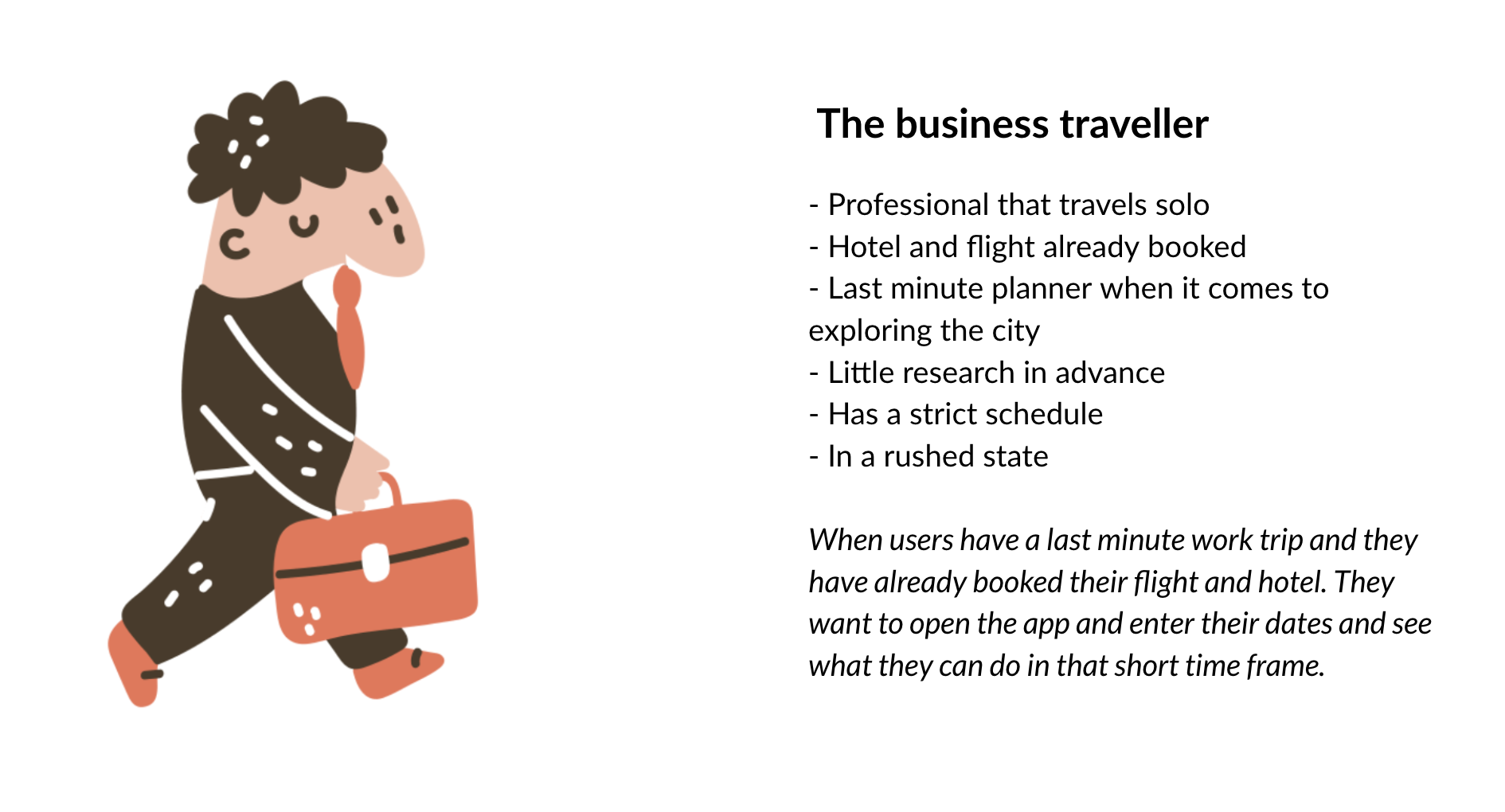
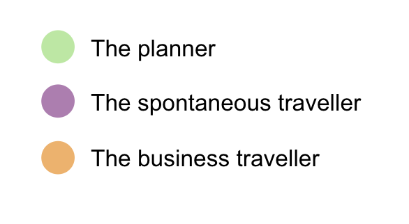
I asked questions like, “Walk me through the last time you planned and went on a trip,” I was able to nail down some user behaviours, needs, goals and synthesize them into 3 user types.
Competitive Analysis
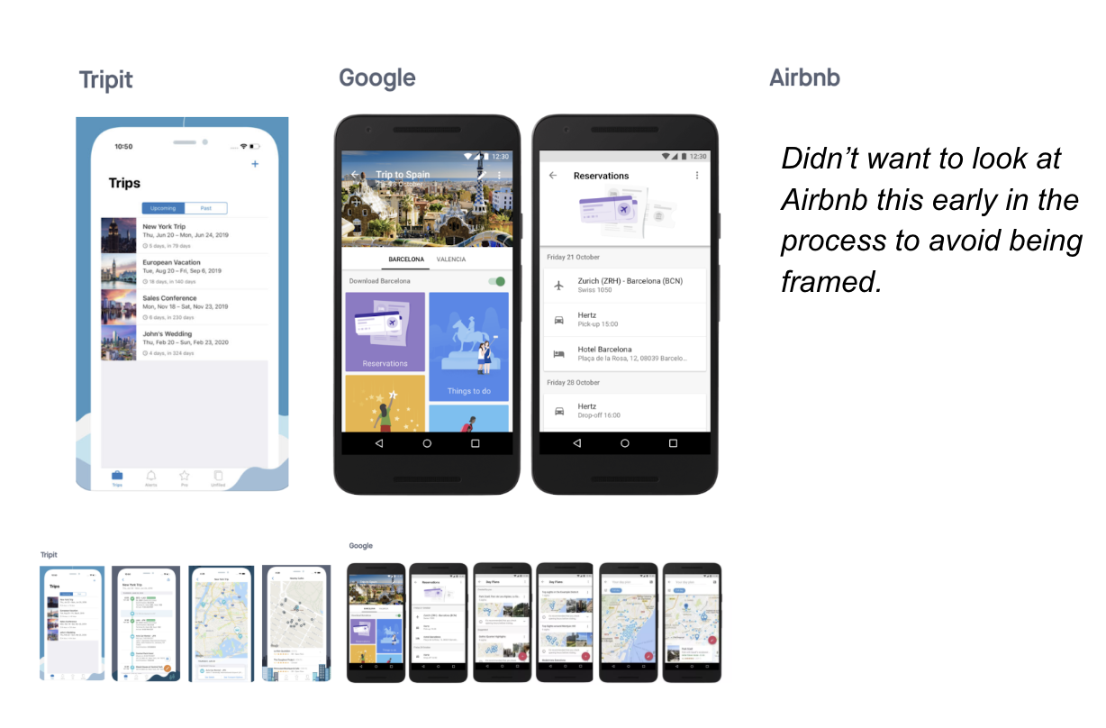
A quick review of the competition gave me an inventory of existing mobile patterns, strengths and weaknesses to begin brainstorming designs for these different types of users.
Other Inspiration
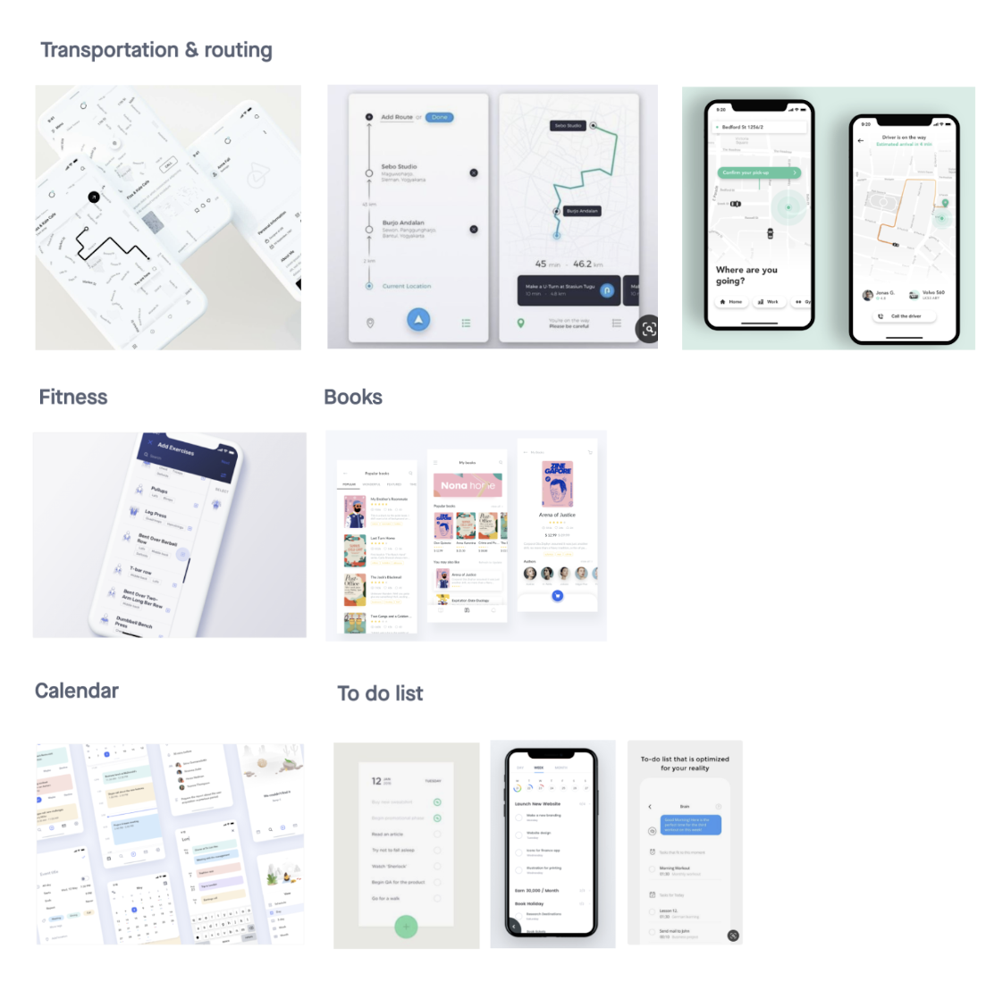
Collecting inspiration from apps in different industries helps me look at the problem a little differently and can sometimes spark ideas.
Requirements Building
Based on the research, competitive analysis and looking at the 3 user types, I was able to put together a list of requirements.
The wishlist feature was serving a purpose of building a library of things they wanted to do. Now we need to allow the user to easily navigate and action the content.
Needed to keep:
- Being able to save articles
- Create multiple wishlists
- customize the wishlist name
- filter your wishlisted articles between food, attractions and places to stay
- Save individual food locations from articles so you don’t need to save the whole article.
Changes in this version:
- Change ‘wishlist’ name to ‘my trips’ so it’s more actionable
- Onboarding flow so users understand how to use wishlists
- Map with all locations you saved
- build an itinerary with a map
- Share wishlist with travel partners
- Add ‘My location’ feature to see what’s near you
- Times locations are open
User Journey
I started to build the new user flow to see how the requirements will address each user type and their needs within the flow.

Sketches
Started designing what the page would look like with being able to navigate to an itinerary.
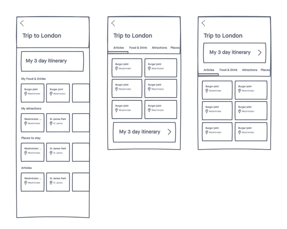
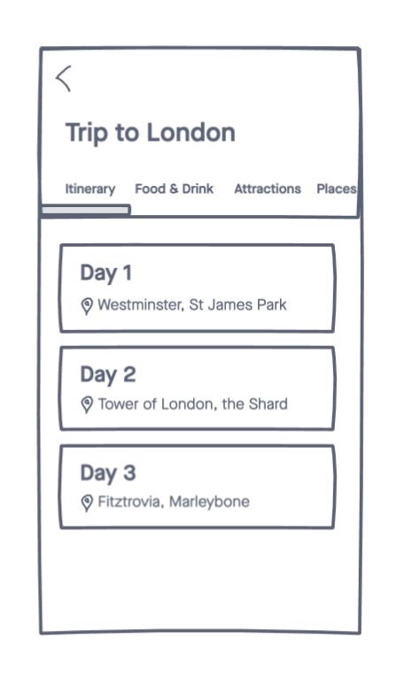
When I tested the layout, participants focused more on the articles and missed the call to action to create an itinerary from the articles.
To address this feedback, I moved ‘Itinerary’ to the first tab and split out the days below it.
Then I started to look at the individual days.
Included a split view of itinerary and map. Didn’t like how participants were navigating between the dates (back and forth) so I wanted to find a way to scroll through the days in this view.
After evaluating the tabs and the blocks, I chose the blocks since it helped focus the user on the day they were on and not cluttering it with other days they haven’t selected yet.
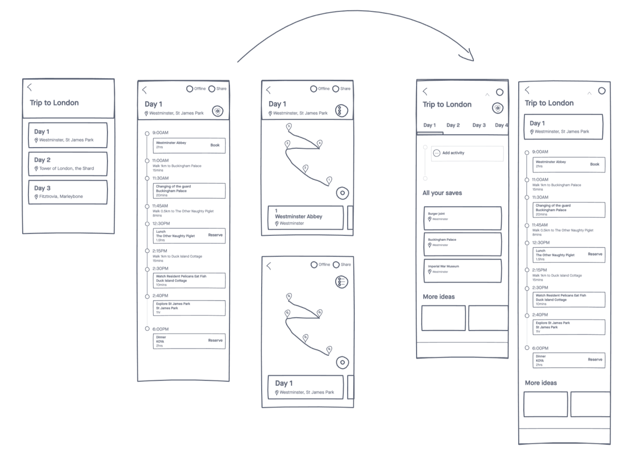
In the final sketches I added the content they’ve saved below so they can easily select and add what they’d like to do that day.
Wireframe & learnings
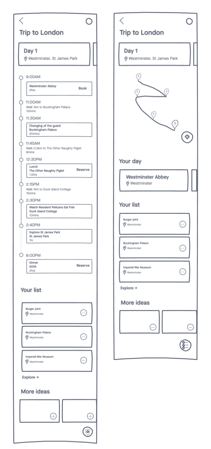
Realized in wireframes the day slider was taking up too much space.
Also when tested, the participants were overwhelmed with how much content was on this page. It was difficult for them to figure out what action they needed to take.
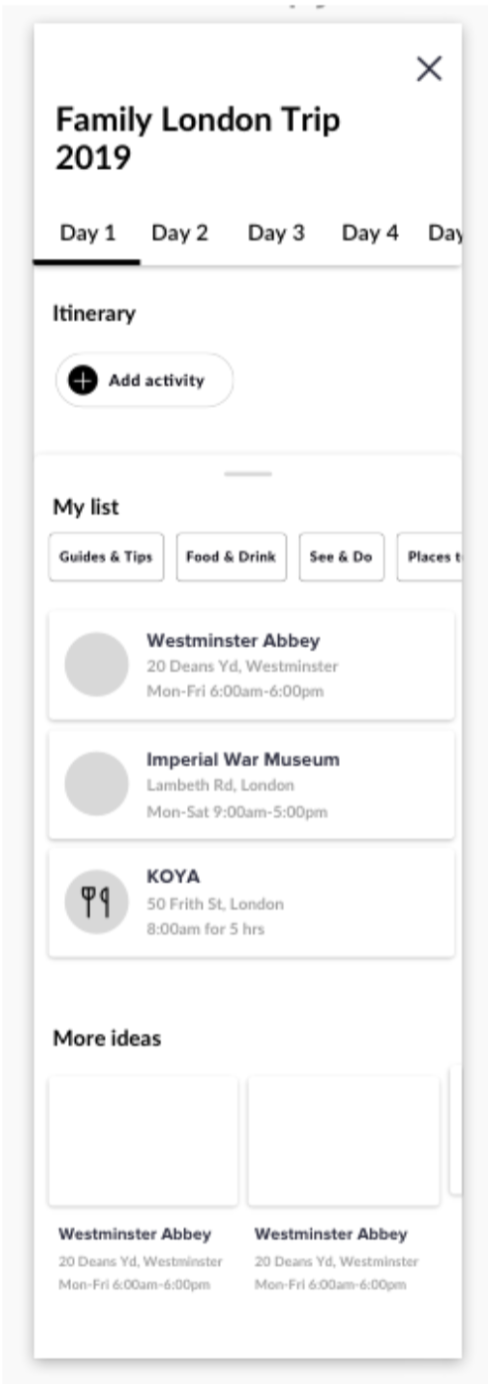
The next version I separated the content on a slider.
I added the tabs for the days again but still didn’t like how it was displaying more information that you needed to see at that point.
After testing again, it was difficult for participants to know how to add content to the list. “Do you pull up and view the things you’ve saved or do you click ‘Add activity?”
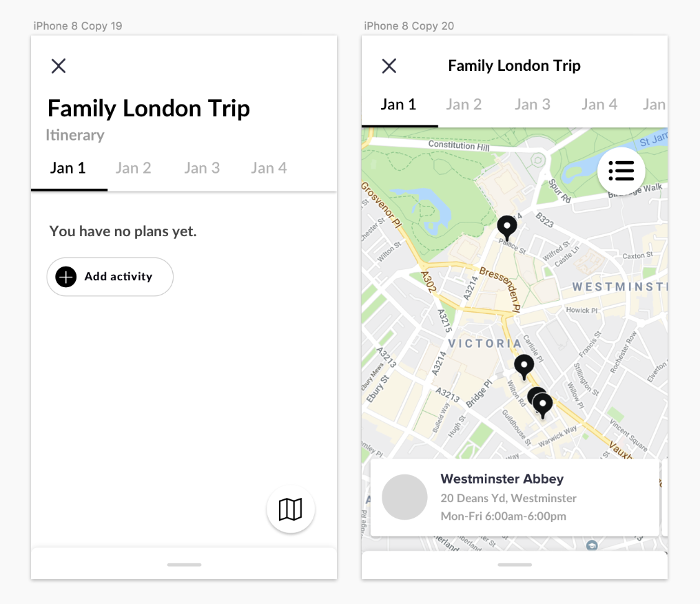
I also realized defaulting to the itinerary and having the map secondary helps the planner, but doesn’t actually cater to the spontaneous or business travellers needs that don’t plan and want to see what’s near them.
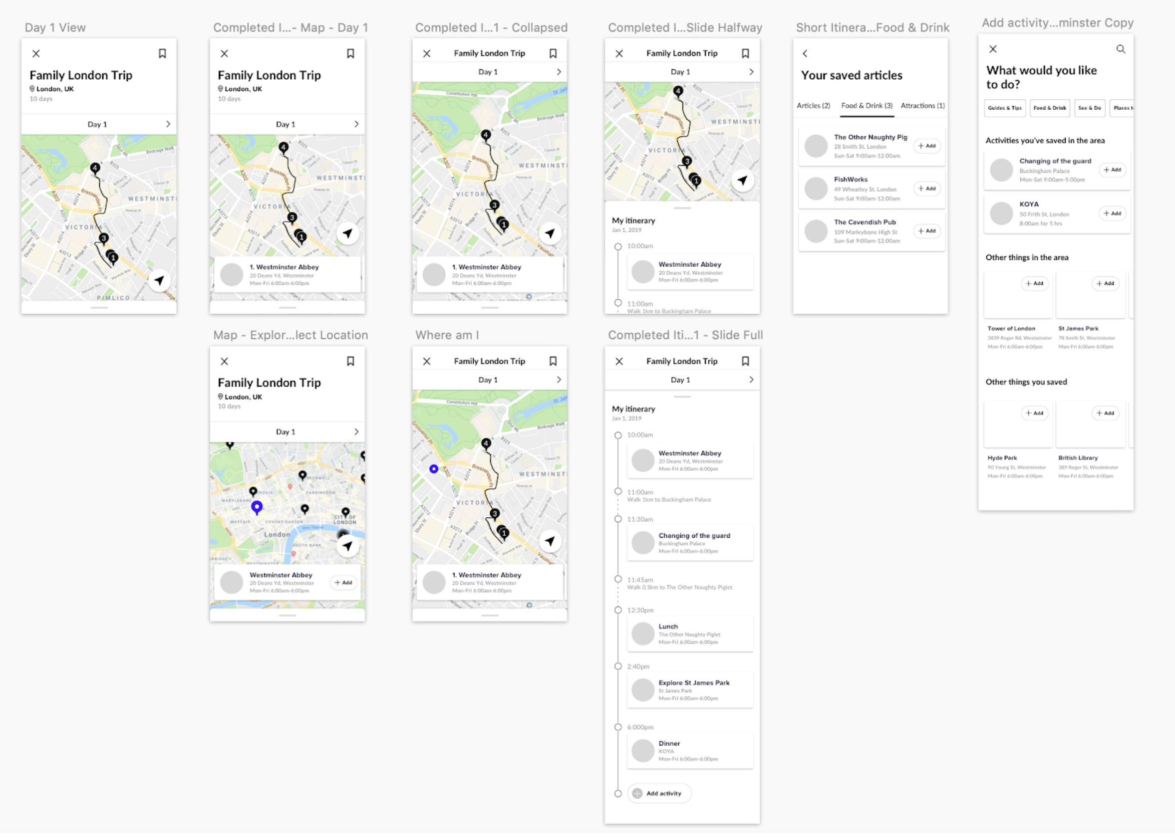
Final wireframes
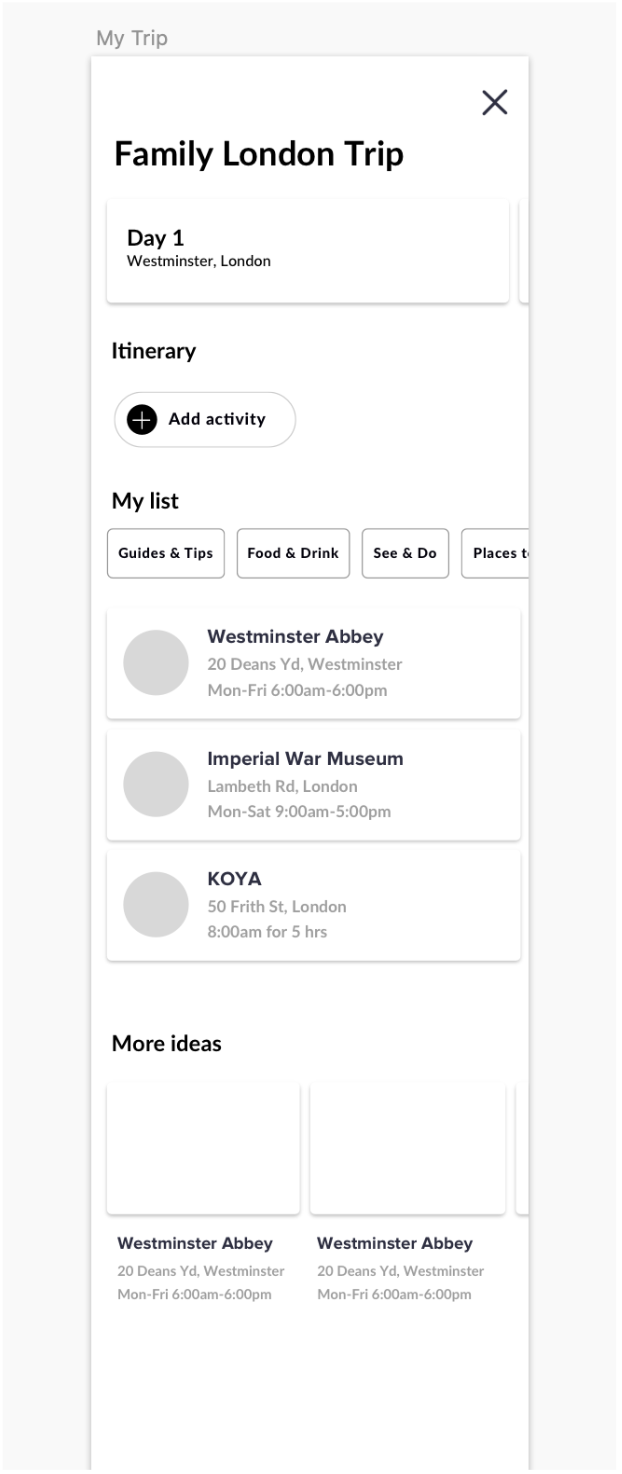
Based on the users needs on wanting to see a map of their locations and see what’s near them, I moved the map to the first view and moved the itinerary on the slider to view their itinerary more in detail.
Updated the day slider.
To add content, they can either add at the bottom of the itinerary which would also recommends things to do in the area or add from their saved articles by clicking the bookmark icon in the top left corner.
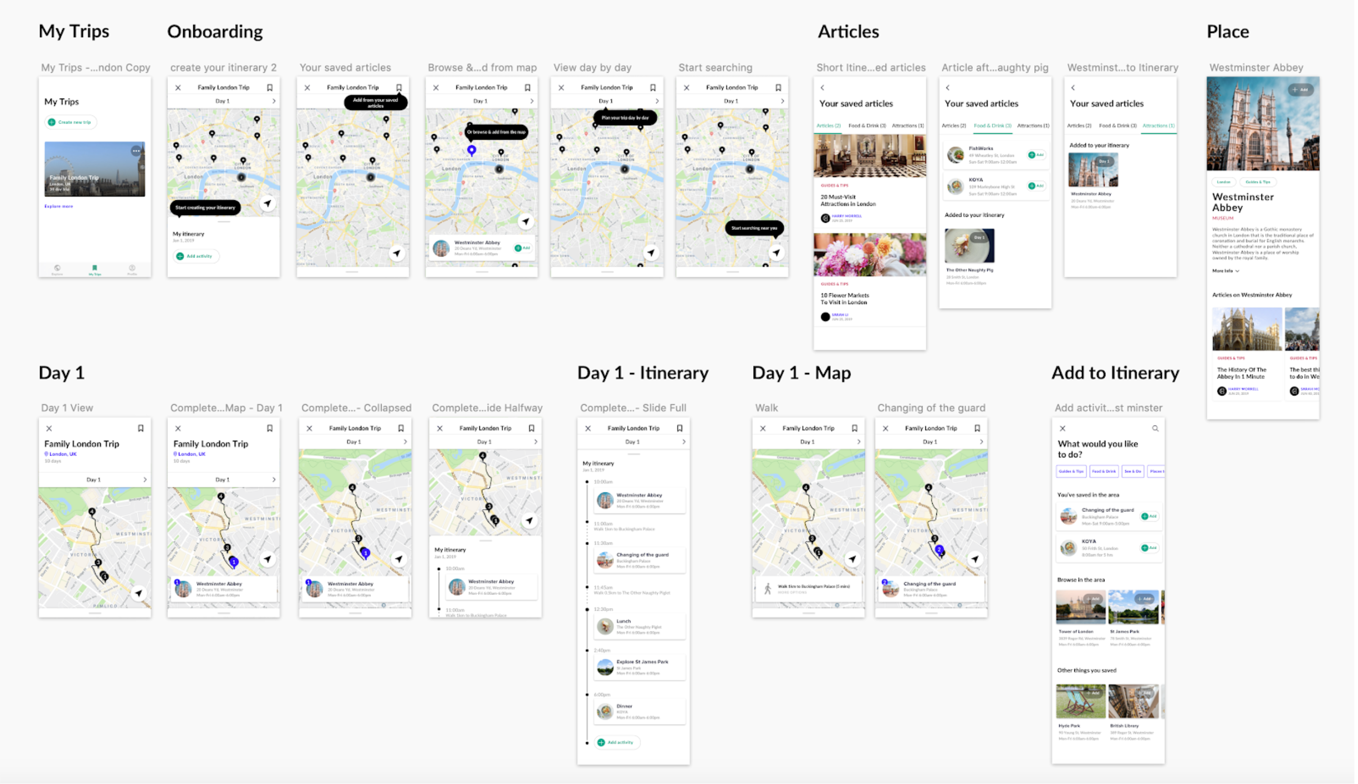
Final designs
Next steps
Next steps would be to test again in the hands of more users to see how it would perform.
The next set of iterations I would build out more flows such as:
Browsing and just saving articles, not actioning them.
Editing your itinerary (moving events around or deleting them). My idea was you could click and hold it and it would provide multiple options or you could drag it to the time in the itinerary you wanted to set it for. But this would still go through multiple iterations.
Don’t share their location – how would the map work and ‘browsing’ from the map work if they haven’t shared their location.
I’d also be curious to see how often users would move events between different days. My hypothesis its it would be easy with the action sheet and being able to select a day and a time but I could be wrong.
Future
There are still lots of different ideas I wanted to explore but for the sake of project scope, I left it for the future.
Being able to book – After adding an item to your itinerary, having a call to action to book/reserve if you haven’t already.
Collaboration – Add travel partners, save notes and booking tickets with multiple friends (who bought theirs already).
Generate itineraries – Adding another step to the onboarding flow where it would ask what type of trip they’d like to take and what they’re interested in and generate an itinerary they could then customize after.
Category:
Culture Trip
