Data driven optimisations
Overview
This is a project I’m particularly proud of because what started off as a design optimisation project using A/B testing, quickly turned into a project of improving knowledge sharing, specifically sharing data and insights, within the organisation. While increasing a click through rate from 1.08% to 2.20%, I also tackled deeper issues like terminology alignment, better documentation and building internal dashboards so we could make data easy to explore and understand. In the end, the work sparked a data alignment project with Operations, BI, Data and Product and lead to the design team pushing the mission of making more hypothesis and data driven decisions.
Background and the initial problem I was tasked with
Some background, Culture Trip is a travel site that inspires 15-20 million unique visitors a month on where to go on the trip or where to stay. The company recently launched bookable tours and places to stay, but these booking pages were getting little traffic and we found that 75% of our traffic would land on an article but the users couldn’t find an experience they were interested in. So the organisation added contextual commerce which slotted additional experiences throughout the article that were related. Over the next 3 months, increasing bookable content on articles from 3% to 36% made up 99% of the increased bookings. It became one of the most important projects in the organisation, and I was asked to optimise the way we display contextual commerce to drive click through rates.
This was the only information I had
YANTRA_P2P_14 = 1.03% CTR
YANTRA_P2P_32 = 1.94% CTR
YANTRA_EXPERIENCES_RAIL_002 = ?

This information meant as little to me as it does to you. When I tried to find some clarity and started asking colleagues for information, I quickly realised that the rest of the organisation had little visibility and understanding of the work that the contextual commerce team was doing despite it being a high profile project. When I tried to find the answers myself and align the team, I found that everyone in the organisation used different terminology which lead to communication issues and quickly derailed meetings. So I created a terminology cheat sheet that I could use to help facilitate these conversations in seeking for answers.
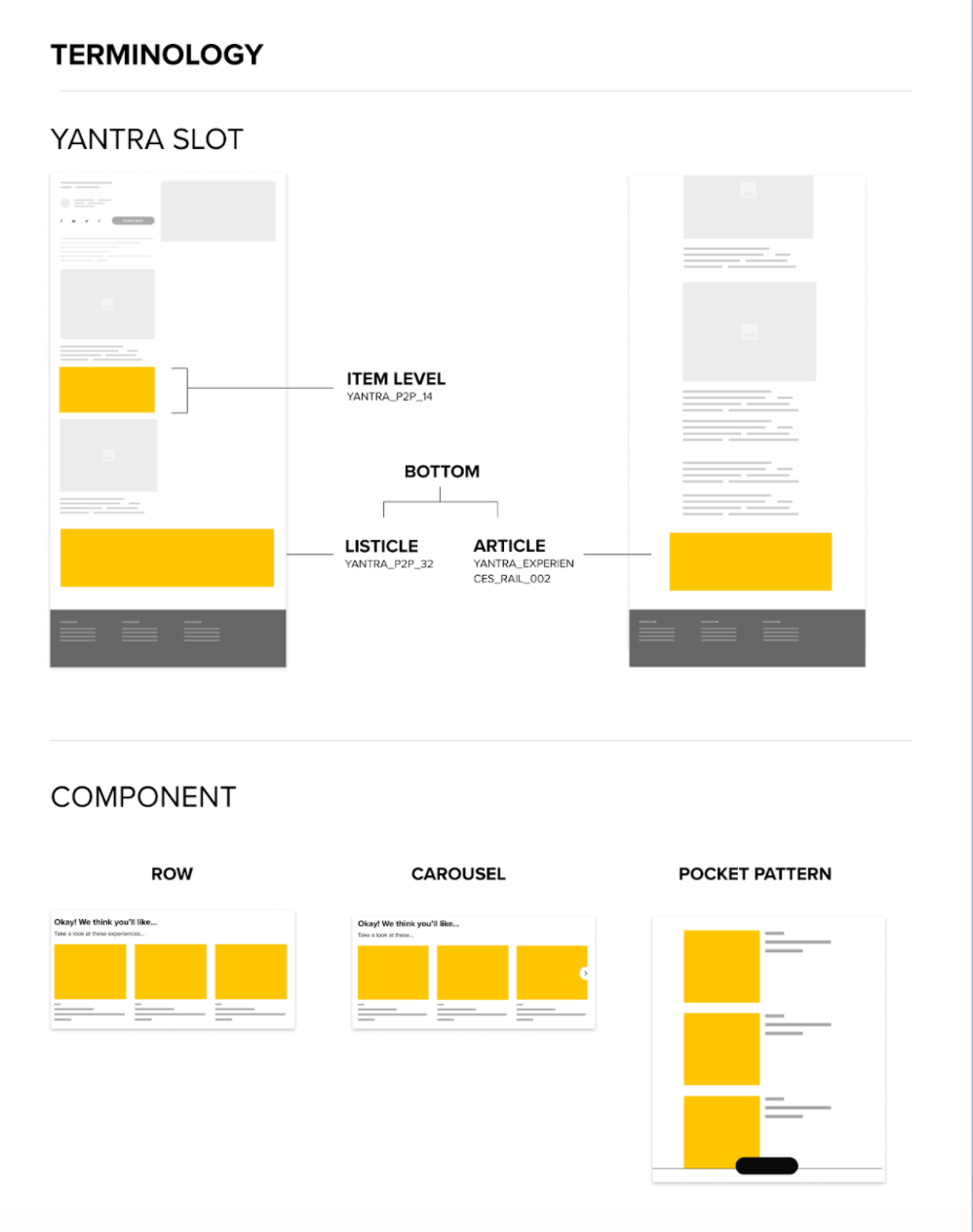
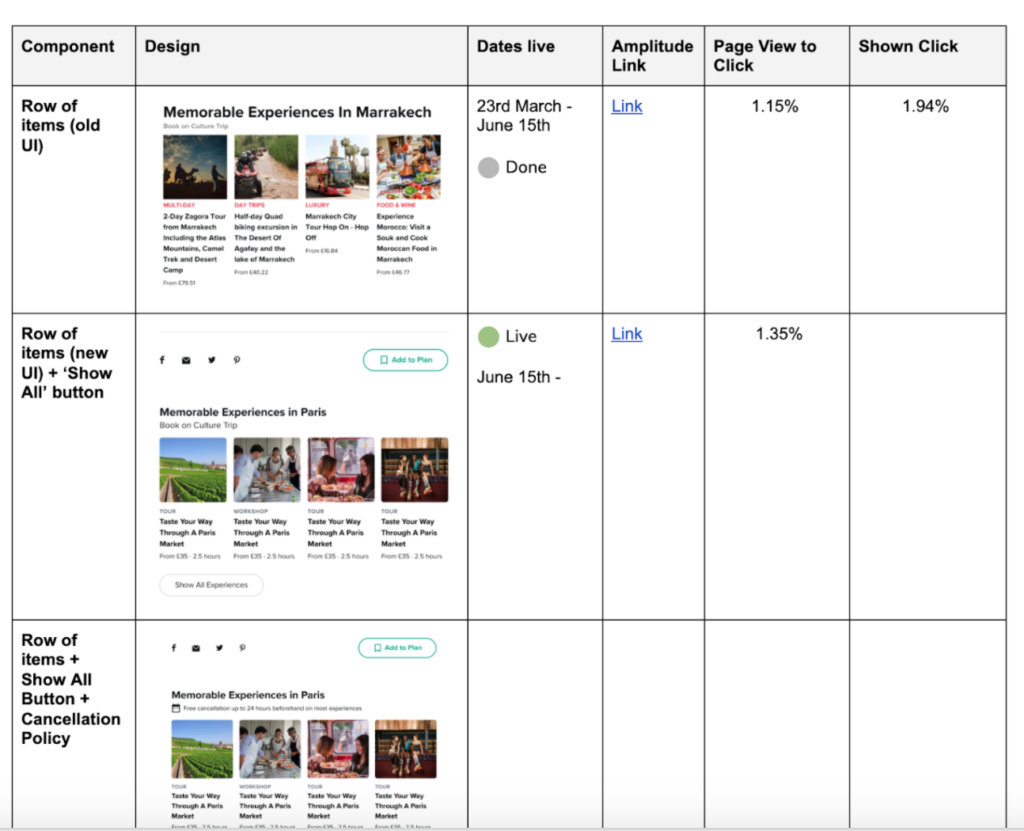
By using this terminology cheat sheet helping collect information and pulling data from our tracking tool Amplitude, I was able to document and summarise all of the A/B tests that have already been run with their results. After sharing the document with the immediate team, the document quickly circulated around the organisation, which to me solidified how little visibility the organisation, including the leadership team, had on this project.
Now that I had all the information I needed, I used these insights to determine small design changes we could make that could have the most impact on the click through rate. To help align the rest of the organisation on what’s to come, I documented these changes into a roadmap they could refer to.
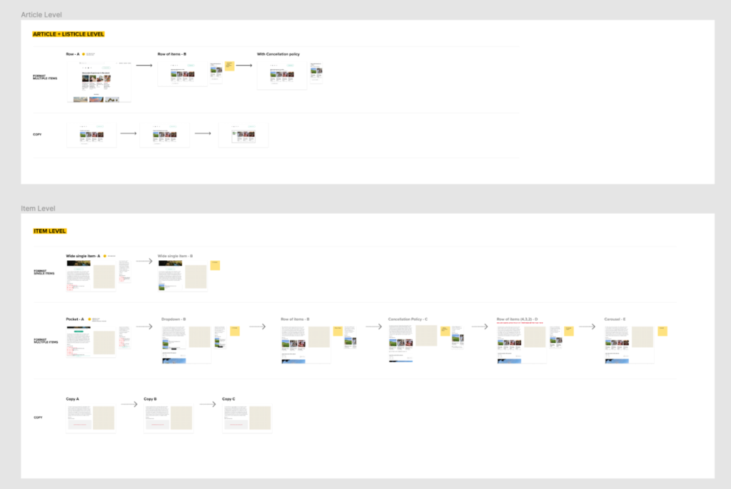
Design roadmap for future A/B tests I created to help align the team
Results
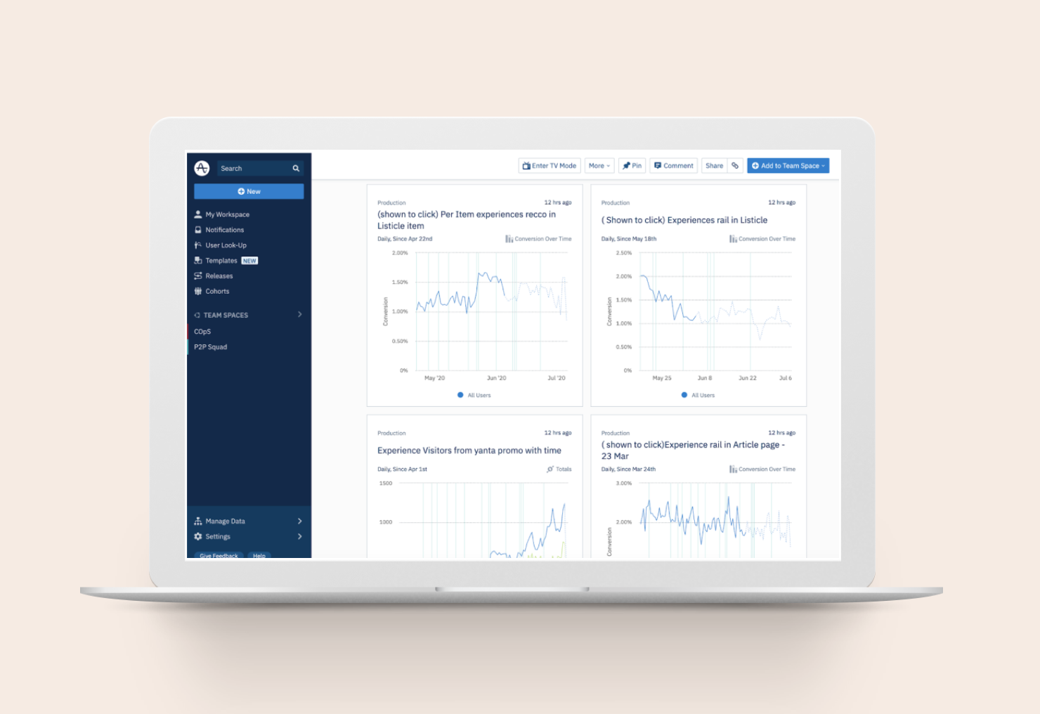
Over the course of 2 months, we were able to increase the click through rate from 1.08% to 2.20% and we built an internal dashboard on Amplitude so we could make this data easier to explore and understand.
In the end, the work sparked a data alignment project with Operations, BI, Data and Product and lead to the design team pushing the mission of making more hypothesis and data driven decisions.
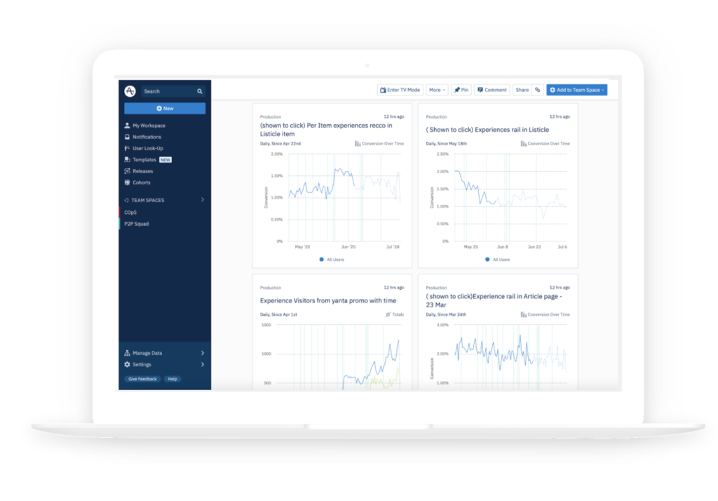
Internal dashboard I created with engineers to make this data more accessible to the organisation
Category:
Culture Trip
